Everyday Dark Patterns You Haven't Noticed, Yet.
Here are seven enshittified things that I now count as dark patterns.

Dark patterns.
You've heard the term—you might even know some common ones—but suffice it to say, the digital world is riddled with them. Just part of the process of enshittifcation that's inevitable when we abscond from our duties as members of a society and let the <sarcasm>innovators innovate<sarcasm>.
For those who don't know, dark patterns are user interface or user experience designs that manipulate encourage the user to take actions that are against their best interests.
Common known dark patterns:
Confirmshaming
Using manipulative language to shame a user into sharing information they otherwise wouldn’t.
Nagging

An app or service that continuously requests something until you finally give in and grant the request.
Privacy Zuckering
A service that collects more information than you intend to give them.
The list goes on and on.
The Road To Hell...
But there are other dark patterns. User Interface (UI) and User Experience (UX) atrocities that we not only accept as normal, but that many folks actually defend with their <proverbial> lives.
This article is about exposing these indefensible, yet startlingly common, dark patterns for what they are.
But how do I define a dark pattern? That’s going to be critical for understanding my list, so here’s my criteria:
Intent and Result
While one can easily declare arbitrary UX patterns as dark based solely on bad faith implementations, the inverse is not true. If the intent of a UI element is good, that does not exonerate it from being a dark user experience.
As the proverb goes, the road to hell is paved with good intentions. We have to consider the resulting user experience of each design element carefully.
Dark UI
Dark UI elements are (intentionally or otherwise) designed to mislead the user, trick them into taking an action that goes against their best interest or that favors the organization behind the design, or even a UI that exploits human psychology to form an addictive (or otherwise unhealthy) relationship with the app or service.
Dark UX
Dark UX consists of everything above, but also considers the subjective experience of the user. So perhaps scrolling down to refresh a feed isn’t designed to be addictive, but the slot machine-style actuation of the refresh gesture and the lottery-like roulette of whether or not you’ll get new content to doom scroll through? That makes it a dark pattern.
So, with that we have a baseline. Now, let’s call out some dark patterns!
Infinite Scroll
I’ve seen a few lists of dark patterns which have included the “infinite scroll” as a dark pattern—but it’s not a universal fixture. It’s actually more uncommon to see infinite scroll, at least on the lists I’ve read. It’s understandable since infinite scrolling isn’t always bad. So let’s talk about it…
Mitigating Factors
Infinite scroll can be used in ethical ways. If both the intent and the result of infinite scroll is to enhance the user experience (read: not to steal people’s time and attention) then it’s probably okay. Bonus points if it is used to save users time.
For example, in the backend of this here blogging system, the list of posts utilizes infinite scroll to reduce the complexity of finding older posts. That’s a useful implementation, it’s meant to save users’ time, and—critically—it’s not designed to STEAL attention.
But I also have qualms about the use of infinite scroll on the frontend of this site. Not only do I find it offensive that I can’t simply toggle it off in the theme settings and that it’s on by default, but it just kinda feels slimy. (I’ve tried to disable it but the theme I’m using in Ghost—though I’ve modded it extensively—seemingly does not support disabling it).
Aggravating Factors
PAGINATED INFINITE SCROLL. There is no excuse for it.
You might be asking, what is Paginated Infinite Scroll?
Paginated scrolling is when scrolling happens a page at a time. Not bad on it’s own. There are definitely good uses of paginated scrolling.
However, when you combine that with infinite scroll? Suddenly your scrolling becomes a lottery where, crucially, you can’t see what’s coming next and you can’t make informed decisions about whether or not to stop. It becomes addictive.

TikTok is an example of a paginated infinite scroll. It is inarguably and irredeemably evil. It has also been copied by YouTube, Instagram, and many other “platforms”, so you know it’s evil.
“Social” Features
Human beings have been using tools to extend their social reach since the dawn of history. Realistically, probably before history, too.

I have no objection to using tools to communicate, nor to be social, to share information, or to love your neighbor.
But what I do have a problem with is when the tool attempts to supplant your communication or hijacks or exploits natural human behavior. When the tool inserts itself into your relationships. When the tool exploits your social connections to steal your attention or keep you hopelessly addicted to the platform; that’s when it becomes a dark pattern.

So if you have a platform like Instagram or Facebook where the whole pitch is to keep you in contact with your friends and family… yet fewer than 1 in 30 posts is something from a real connection? That’s exploitation. And if your timeline is further polluted by highly exploitive "personalized ads"?
More Dark Social Features
Modern group chats are also dark social patterns. Especially with read receipts enabled. Why? These chat apps exploit the natural social pressure of your friend group to keep participants in the group engaged, to keep reading, and follow the conversation, lest you fall behind. This is bad for you, it keeps you using longer than you might want to, and it's by design.
Another dark social feature? Stories.

Yes. These. Why? Because they’re basically notification badges…
Notification Badges
When done wrong, notifications are very often a vector for dark patterns.
I’m sure you’ve noticed notification badges (what I've recently taken to calling notification bugs) on a website you’re not even logged into it.
There's a good chance you've also seen unlabeled notification bugs. Sometimes they're not dismissable until you actually engage with the notifications.
You’ve probably seen floating AI chatbots that tease you with a bright red badge, goading you to engage with it.
Or what about this f***ing notification bug on Instagram’s web client that is literally lying.
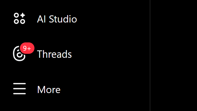
The Instagram account I’m logged into does not have an associated Threads account. So it is actually impossible for me to have “9+” notifications on Threads. If you click it in the Instagram app it takes you to Threads in the App Store.
These badges are specifically designed to annoy you into clicking them to dismiss the little red badge. And those badges are designed to be annoying. It’s to the point where if I include screenshots with notification bugs in my videos, I get angry comments about them.

Then, there's the other kind of lying notification bug. One that's trying to drive engagement. Click the above notification button and it takes you to this...
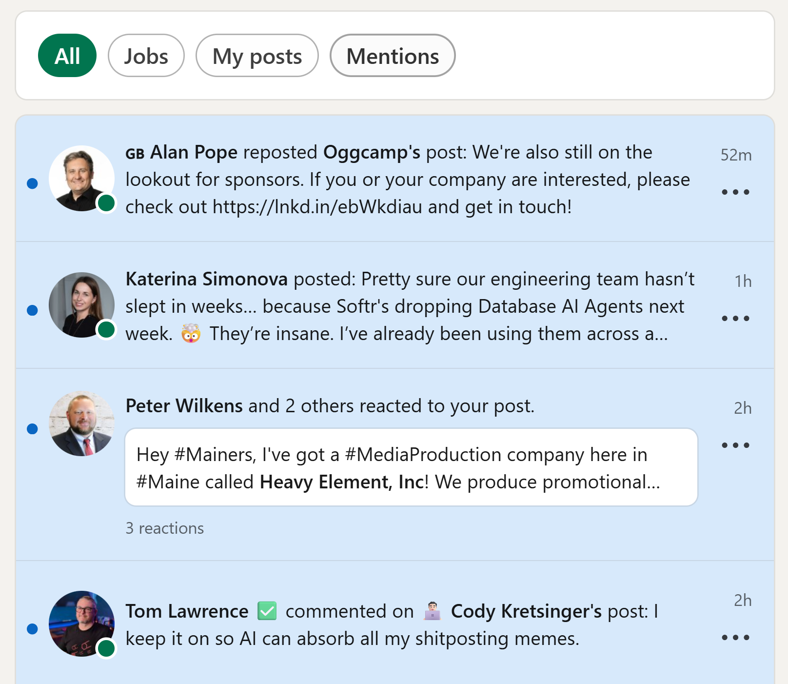
This is no slight on Alan Popey or Tom Lawrence. I'm connected with Alan and Tom on LinkedIn and I've even had excellent conversations with both of them in the past! I don't know who Cody or Katerina are. I've also never heard of Oggcamp... and I could not care less about these fake notifications. So the only real notification here is from Peter Wilkens who reacted to a post I made on LinkedIn.
The notifications panel is acting as a dark feed. Why? My guess: <speculation> some full-time LinkedIn psychologist decided that users needed to form a habit of checking their LinkedIn notifications and, since notifications were so infrequent on the platform, they just started making them up.<speculation>
Mitigating Factors
Look, they have a valid use. If notification badges are used to inform you of new, useful information you’ve elected to see, they’re fine…
Aggravating Factors
If they’re being used to steal your attention, bait you into engagement, or if they appear without a number in them; they’re dark patterns. If they’re used to trick you, if they represent notifications you haven’t opted in to seeing, or they are a front for ad delivery they are decidedly dark patterns.
At the risk of becoming the old man yelling at clouds…
The Instagram web client is littered with other dark notification bullshit.
What would you expect to happen if you clicked or tapped on the notification below?
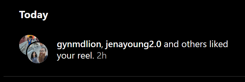
It should take you to the notification in question, right? At least, that’s what would make sense.
What if I told you clicking that notification doesn’t take you to the reel that these folks liked. In fact, it does nothing. Despite the notification highlighting when I hover over it and my cursor changing to indicate a hyperlink… it doesn’t do anything.
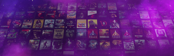
Online Multiplayer

I’m a single player gamer. I’ve been on the record as (generally) being opposed to massively online games.
Not trying to yuck anyone else’s yum here, but most online games are gross dark patterns. Not all... there are a few good ones. Titles like OpenRA and Minecraft come to mind.
But the problem is: games are meant to be fun. If a game isn’t fun, then it’s not worth playing. But guess what is inherently fun? Playing a game with your friends. Even if the game itself is NOT.
That’s the rub.
Online multiplayer is fine… until it isn’t.
Mitigating Factors
Games with local multiplayer? Perfect.
Games where the single player experience is enhanced by multiplayer? Totally fine.
Aggravating Factors
If a title features one or more of the following, it’s online multiplayer should be considered a dark pattern:
- Games that have a limited or hamstrung single player experience.
- Games that are not fun unless you’re playing against another human.
- Games that use the social pressure of online play to sell cosmetics/DLC.
- Games that use psychological tricks to keep you playing for longer than you intended.
- Games that use online multiplayer as an excuse for DRM, invasive client-side anticheat, or justifying a persistent connection.
- Games that waste your time with long pregame queues, intentionally unbalanced matchmaking, or employ other psychological tricks to keep you addicted.
Overwatch, Fortnite, Apex Legends, Halo Infinite, Team Fortress 2… the list goes on and on.
Streaming Services

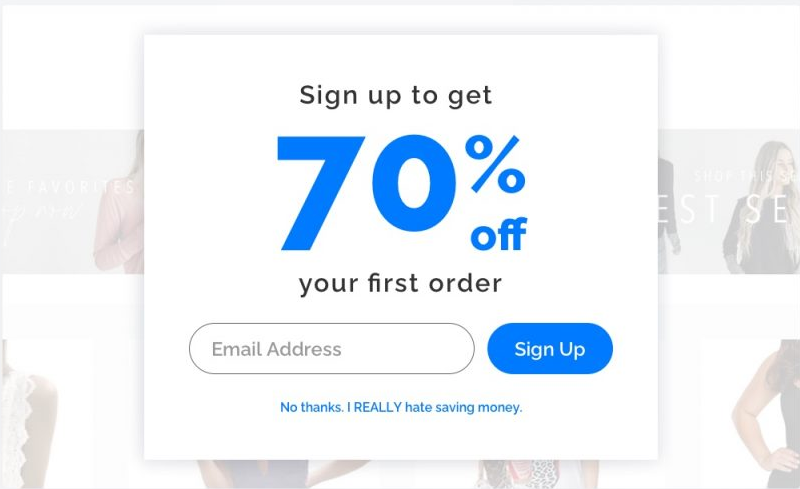
Streaming services are notorious for their deployment of dark patterns. Things like the “Next Up” autoplay, false continuity, free trials, roach motels, confirmshaming… the list goes on and on and on.
But I’d argue that streaming services themselves have become the dark pattern.
The user experience of these services is intentionally designed to make you forget about the nominal monthly fee. Plus, it's all based on the concept of the bait n' switch:
You get a huge library subset of content all for just $4.99 at the base tier of $6.95 a month, or get an ad-free limited ad experience for just $9.99 $11.95 a month. That's right: every show/movie/song you could ever want our walled garden of exclusives you simply cannot live without!
And if you stop paying that $14.99 $16.99 a month, you’ll lose access to all of the MCU, all of the DCU, all your Spotify playlists... and all the money you've spent over the last 10+ years is just simply gone. And then what are you going to do?
Spend $50 once for a TV antenna and watch over the air network television or listen to the radio for FREE… like some kind of pleb?!
Right now, for a limited time, you can pay just $17.99 a month for ad-supported streaming or upgrade to the premium $20.99 $38.95 for the limited-ad bundle at the introductory price of $5.99 for the first three months with no a yearly contract.
What do you mean you’re trying to cancel your subscription? That feature is not supported in the app. You need to call 1 (844) SKRBN-1MIN, wait on hold for an hour, and plead your case to our highly trained Consumer Retention Specialists who—at their discretion—may decide to let you pay the cancellation fee.
Woof. I got a little salty. But hey. It can’t get much worse than that, right?
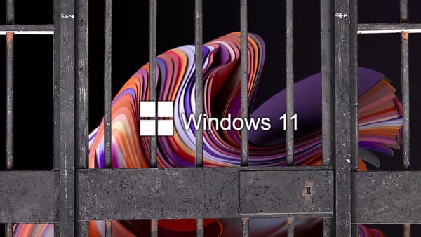
Software & Firmware Updates
SOFTWARE UPDATES.
Now, don’t get me wrong. Keeping your Internet-connected devices up-to-date with the latest security patches? That’s important.
So why am I saying that software and firmware updates are dark patterns? Well, as with many of the other entries on this list... not all of them are.
But non-essential updates, updates that break compatibility, updates that remove features, updates that intentionally degrade the user experience, upgrades that are designed to push an unrelated service, that arbitrarily change the UI/UX, or that are not optional? I’d consider all of those dark patterns.
Also, there is literally ZERO valid reason for your appliances to be connected to the Internet. Nobody will ever be able to convince me that your toaster should be smart.
Online Contracts
Now we get to the OG dark pattern of the world wide web: Terms of Service, End User License Agreements, and other dense, arcane jargon of dubious legality. Nobody ever reads them, yet we’re forced to agree to them in order to continue using the services we rely on.
Not only are changes to the terms arbitrary and they can come at any time; but they essentially act as private laws. These are essentially dark laws which are dictated by corporate entities as an agreement outside the legal system of Enlightenment Era values.
Courts, at least in the US, have historically shown great—even concerning levels of—deference to the terms. This deference lends legal credibility to the system of dark, private laws that are the hallmark of corporate colonization of both the free and open web and public mindshare.
Can Terms of Service or End User License Agreements be done right? Yes.
Can I think of a single example off the top of my head? No.
What would it take for ethical terms to be produced?
- Short — Meaning fewer than five (reasonable length) paragraphs.
- Readable — Meaning zero legal jargon.
- Fair — Terms must respect the rights of end users. No forced arbitration.
- Reasonable — Lay out the rules for using the service.
- Guarantees — Terms must define the ways in which the terms may never be changed, limit how frequently they can be changed, and provide guarantees of the rights of the end user.
- Proof of Receipt — (Probably my most controversial take…) to sign up for a service, users should have to answer a quiz about the terms that prove you’ve actually read and comprehend them.
That last one especially will never happen without strong regulation. But I think it’s critical as a simple checkbox “I agree” shouldn’t hold legal weight. A demonstration of conscious understanding and legal competence should be required to enter into a contract.
I'd love to hear your thoughts on everyday dark patterns. Let me know in the comments blow!
About The Author:
Gardiner Bryant
I'm an educator, free software advocate, and storyteller. My passion lies in Linux gaming, self-hosting, the fediverse, and the human stories behind the tech we use every day. I believe in privacy, justice, community, and integrity.